App Elements
Details on various applications elements
Within some of the layout elements, there are other components that you can embed in those higher level components to extend their functionality.
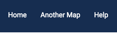
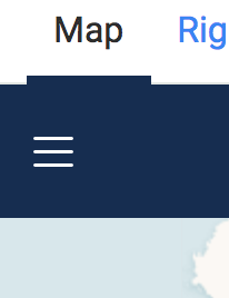
Header
Below is a sample file for Header.js :
As you can see here there are several Isthmus components as well as Airship wrapper elements. You can use the framework provided here, or create your own by reviewing the Airship Toolbar documentation here.
Header Toggle
The HeaderToggle component handles the menu toggle when the application is in responsive or left/right navigation mode. It requires no props.
Header Link
The HeaderLink creates a link within the nav section of the toolbar as shown above. It takes the following props:
Prop | Description |
| The name of the link that will show up in the toolbar |
| The route of the link - see more in the Pages & Routers section |
Avatar
The Avatar creates an Airship Avatar within the toolbar and must be wrapped in the as-toolbar__item class, or it can be used in any other area of the application. It takes the following props:
Prop | Description |
| Size of the Avatar - options are |
| Image alt tag |
| Link to the icon that will show up in the Avatar |
Other Elements
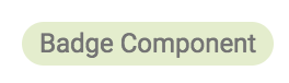
Badge
The Badge component will add a simple badge to your application and takes the following props:
Prop | Description |
| Color of the badge - see the Airship docs for more info. Options include |
| Text name of the badge |
| Text color of the badge - see the Airship docs for more information |
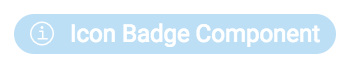
IconBadge
The Badge component will add a simple badge to your application and takes the following props:
Prop | Description |
| Color of the badge - see the Airship docs for more info. Options include |
| Text name of the badge |
| Text color of the badge - see the Airship docs for more information |
| Name of the icon you want to add - see the Airship docs for more information |
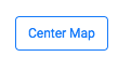
Button
The Button component will add a button into your application. You can also define a function that you can pass to the button when it is clicked. It takes the following props:
Prop | Description |
| Name displayed on the button |
| A function, defined in the component where you add the |
| Button type - see the Airship docs for more information. Options include |
| Button size - see the Airship docs for more information. Options include |
LinkButton
The LinkButton component will add a button into your application. You can add a link that the button will open in the props. It takes the following props:
Prop | Description |
| Name displayed on the button |
| Link that the button will open. Defaults to opening in a new tab. |
| Button type - see the Airship docs for more information. Options include |
| Button size - see the Airship docs for more information. Options include |
InputButton
The InputButton component will add a button into your application as an <input ...></input>
Prop | Description |
| Name displayed on the button |
| Button type - see the Airship docs for more information. Options include |
| Button size - see the Airship docs for more information. Options include |
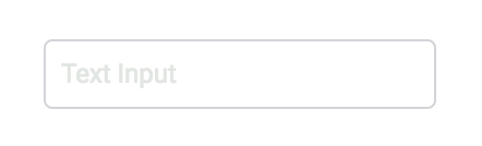
Input
The Input component will add a simple input into your application as an <input ...></input>. You can repurpose it to use it as you see fit. It takes the following props:
Prop | Description |
| HTML id of the Input |
| Text placeholder of the input |
Last updated