App Layout
How to set up your app layout and pages
Layouts & Pages
To begin building your application, you need to decide on your application layout. We use the Airship layout as described here.
You can add any layout component to the Page.js component. Below is an example of the Page.js layout:
Order is very important in this layout so please keep this in mind. We recommend using this layout as a starting point, then removing the components that you do not need.
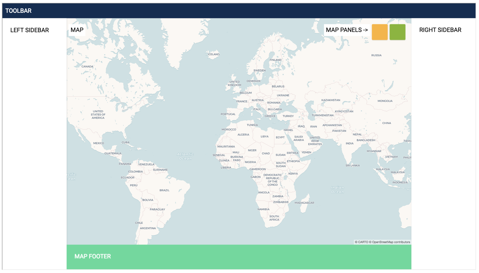
There are several components that make up the layout elements:
Component | Description |
| This component contains the actual map that is rendered on the |
| The header component ties into the toolbar in Airship |
| Ties into the Right Sidebar |
| Ties into the Left Sidebar |
| Contains the map panel(s) |
| Footer elements |
Below is an overview from the Airship documentation of the labeled layout element types.
Components
Header
The Header component takes no properties, but contains several other elements that can be used inside it which will be covered in the next section.
CARTOMap
The CARTOMap component takes no properties and is self contained, however you can make modifications within that file for more custom use cases.
Panel
The Panel component will add a map panel on top of the CARTOMap component and contains the following props:
Prop | Description |
| Vertical position of the panel. Options are |
| Horizontal position of the panel. Options are |
| Background color (optional) - see Airship color types, colors are added with the syntax
|
| Title for the responsive tab |
BottomBar
The BottomBar component is tied to the Footer element in Airship and takes two props:
Prop | Description |
| Background color (optional) - see Airship color types, colors are added with the syntax
|
| Title for the responsive tab |
RightBar
The RightBar component will add a Right sidebar to the application. It has the following props:
Prop | Description |
| Changes the size of the sidebar. Options are |
| Background color (optional) - see Airship color types, colors are added with the syntax
|
| Title for the responsive tab |
LeftBar
The RightBar component will add a Right sidebar to the application. It has the following props:
Prop | Description |
| Changes the size of the sidebar. Options are |
| Background color (optional) - see Airship color types, colors are added with the syntax
|
| Title for the responsive tab |
Last updated